
When considering a piece of graphic design work, especially when it comes to your brand’s look and feel, you may tend to use your ‘critical brain’ to analyse.
It’s easy to overthink this, and end up with a result that kind of pleases everybody but doesn’t really say all that much.
In reality, a lot of the communication of graphic design happens subconsciously – without us even knowing. The human brain recognises colours, shapes and textures and adds meaning to them before we even have a chance to make a rational decision on what colour to use for the logo, or what shape to make a specific icon.
If you can understand and harness this subconscious communication, you’re well on the way to creating graphic elements that are irresistible to the brain – those big-brand logos that we all know and could draw with our eyes closed.
Here are three common graphic elements, how they work on our brains, and how you can use that force for good.
Colour is a messaging shortcut to the brain.
It’s always among the first things to be considered when designing for a brand – it forms the backbone of all designs and will usually appear in some form in everything you produce. Colours contain emotional meaning, signifying a tone and energy about the brand that is perceived immediately by viewers.
Colour is powerful as a categorising tool. It helps customers to gain an understanding of your brand instantly. Everyone’s brain already contains a lifetime of associations built up through exposure to thousands of brands. Green might convey an environmental consciousness, or suggest energy and efficiency. Red conveys heat, speed, and famously hunger.
Breaking with these standard associations can work, but it comes with risk – and it helps to understand the rule you’re breaking BEFORE you break it.
Choosing a wild colour, for example, might come at the expense of clarity – but it can make your brand stand out in a crowded space. Think of ONE’s bright pink shipping containers. They’re definitely a standout in the logistics sector, but what do you think of when you consider ONE as a brand?

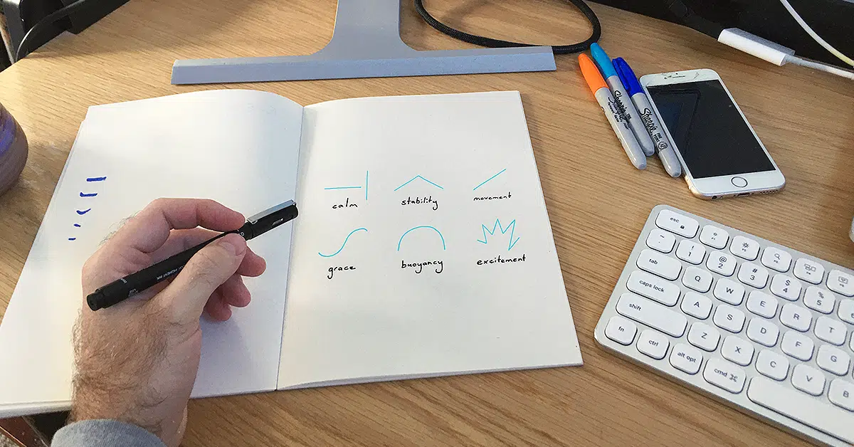
The foundational elements of a design are colour, images, and type, but these all need to be contained within shapes.
The shapes that holds your design together says just as much as the design itself. Think of the strong ‘shield-type’ shapes that sit behind sports team emblems, or the varying shapes that back car brand logos.
It’s important to be deliberate about how these forms are used. Things to consider when choosing a shape:

Maybe a combination of these ideas is best suited to your purpose. Often these choices will align with your font selection, and should remain consistent across your materials. By combining these elements you’re building up an association between visual tone and your brand for your audience.
Our world is full of rich textures and patterns, both natural and designed by people.
Historians can trace human history through the patterns of different cultures in textiles, stone or architecture – just as biologists can track the vast history of the natural world through textures and patterns in trees, fossils or even on a frog’s back.
Historic or futuristic, natural or manmade – all textures and patterns are both decorative and purposeful in conveying meaning.
Texture often falls into the background as we’re perceiving a design or object, but it’s integral in conveying a sense of quality, tone and purpose. A smooth plastic conveys something different to a machined aluminium surface of an iPhone, for example.
In the design arena, textures and patterns can be brought in as recurring visual elements that add a richness and depth to a design, and communicate a theme in combination with colours, shapes and typography.

I developed this abstract pattern as a visual element for use in TMP materials. It symbolises a transition from chaos to structure, organisation, and routine. It’s subtle, and doesn’t interfere with other elements – but it enriches designs with a little extra depth, and becomes a recurring motif that unifies our designs.
A pattern can be colourful or monochromatic, simple or complex, it’s just important that it supports your brand, is reusable and timeless (won’t become stale when used repeatedly), and is versatile enough to be used on big and small screens alike.
Your ‘brand’ is just an idea in your audience’s head. You help shape that through your actions, the words you choose and the visuals you use to present yourself.
Through these elements you convey a series of associations to your audience: what you stand for, how you do business, your brand’s attitude and outlook on the world. Strike the right tone and you’ll resonate with your target audience – whether that’s corporate professionals, tradespeople, public servants or anything in-between.
The colours you choose, the textures and patterns that carry those colours, and the shapes that contain them, all play their part in conveying to your audience what you’re all about.
Use my tips above to make sure you’re always getting their right impression across – whether your audience realises it or not!