
Ever spent a bunch of time and budget refreshing your logo and brand platform, only to dread how soon you might need to update it all again?
It’s the inevitable cycle of marketing: Businesses trapped in an infinite loop of building, consolidating, and refreshing their brand.
How much capital is there in consistent branding? What’s the lifespan of design trends? How do you know if branding will continue to resonate as your audience grows? And how do you know when it’s time to burn it all down and start again?
Contents:
How does graphic design shape branding?
Should you follow industry trends?
What does a successful rebrand look like?
How to use design trends to your advantage
What’s in a trend?
Trends are a funny thing. Whether you’re talking about fashion, music, or graphic design, trends come and go frequently. This can be driven by a range of nebulous factors, like the whims of prominent tastemakers, critical mass of widespread adoption, or the natural cycle of trend revival.
But this poses a dilemma: Should you devote yourself to constant reinvention as dictated by passing fads? Or ignore them and risk being left behind?
In marketing, there’s also an extra layer to consider in terms of the capital built up over time from consistent, recognisable branding. If you hear ‘golden arches’, for example, pretty much everyone knows what brand that refers to. And you can bet that kids will instantly spot the red and yellow sign cresting over the horizon on a long car trip.
Graphic design trends communicate via the common visual language of the time. It acts as a kind of shorthand for effective storytelling that speaks to evolving consumer interests. The flipside, however, is that it can risk coming across as inauthentic or muddy the waters when it comes to brand consistency.
So, what to do? What are design trends worth? Is it even worth being trendy? And how do you evolve a brand without losing what you’ve built?
How does graphic design shape branding?
Whether we like it or not, every piece of brand output — from logos, to typography, to colour palettes, to tone of voice — exists relative to the public’s general perception of trends.
A lot of graphic design is underpinned by deep symbolism and lengthy rationales around why a certain line is at a certain angle in a corporate logo. From an audience perspective, where people aren’t obliged to pay attention to anything beyond their own convenience, the end product largely boils down to ‘vibes’.
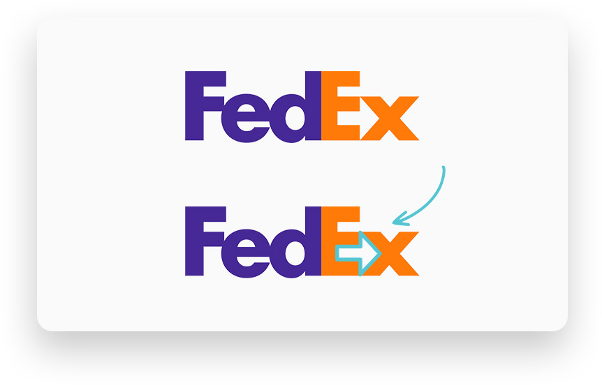
Visual branding is littered with clever touches that most casual observers won’t even notice on first glance. Like the arrow hidden in the FedEx logo. Or that the ‘smiley face’ arrow in the Amazon logo goes from ‘A’ to ‘Z’ (while also ignoring that there’s a whole other ‘A’ right next to the Z).
These elements tie together to create something cohesive and memorable. The audience might not always know why it works, but it does. And it’s thanks to the attention to detail applied by designers.
Consider another example. One of the simplest, most recognisable logos: the Nike swoosh. Like the FedEx arrow, it points to the right — the direction our reading eye associates with progress. It also angles upwards, reflecting the positive reinforcement of a tick. It swoops around and tapers to convey dynamic motion — perhaps tracing the path of a tennis racquet, a golf club, or the arc of a leg as it kicks a ball. All of these micro signifiers align coherently with the brand identity. As an audience, this all flickers instantly in our subconscious. Nike = Sport. Sport = Nike.
Should you follow industry trends?
As trends become more widely adopted, they start to form a recognisable language. At the same time, perhaps that style starts to lose what made it striking in the first place. For example, tech companies have traditionally favoured the colour blue for its clean, understated aesthetic.
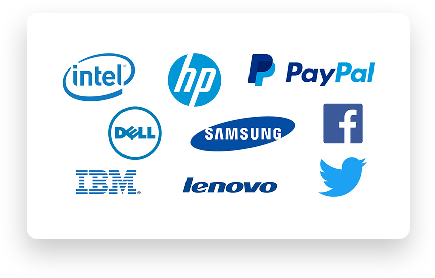
Some of these brands have existed for a long time (IBM’s blue logo has been in use since 1946), and aren’t seen as quite so cutting edge as they once were. More recently, Facebook has seemingly become a refuge for ‘boomers’ as younger generations have moved on to other social platforms. Suffice to say that this colour palette which once stood for innovation may now be more associated with legacy organisations. A quick look at popular apps probably reflects how tech and social media brands have since embraced a broader colour palette.
But it can get tricky. Trends are interwoven, and their presence is felt differently by different segments of your audience, depending on their demographic. The perfect font for a 45-year-old builder might be different from a younger architect’s tastes, even though these are both part of a supplier’s audience. That sentence in itself is a pretty absurd thought to consider. So brands often have to exist in the ‘in-between’ in order to balance tastes.
Trend saturation can also be a design hazard. The nature of trends can lead to competing brands all jumping on the same bandwagon — to the point that things which once stood out from the pack become ordinary, even stale.
Should you go your own way?
With this in mind, there’s an argument for going your own way — forging your own cluster of signals, with a unique branding approach distinct from the rest of your industry. However, this approach still requires awareness and fluency in what’s being done elsewhere.
Doing your own thing comes with higher risk, but can command more interest. In the same way that whispering can be a powerful tool — provided you’re interested in what someone has to say. You lean in, pay closer attention. If you’re surrounded by a room full of people shouting, you’re more likely to seek out calmer, quieter energy.
Likewise, if a space is quiet, one person making a racket will stand out. Trends are a little bit the same. If everyone’s doing the same thing, there’s power in pivoting to a completely different approach. It commands greater intrigue. But you can’t stay unique forever without a willingness to adapt.
Out with the old, and in with the old (again)
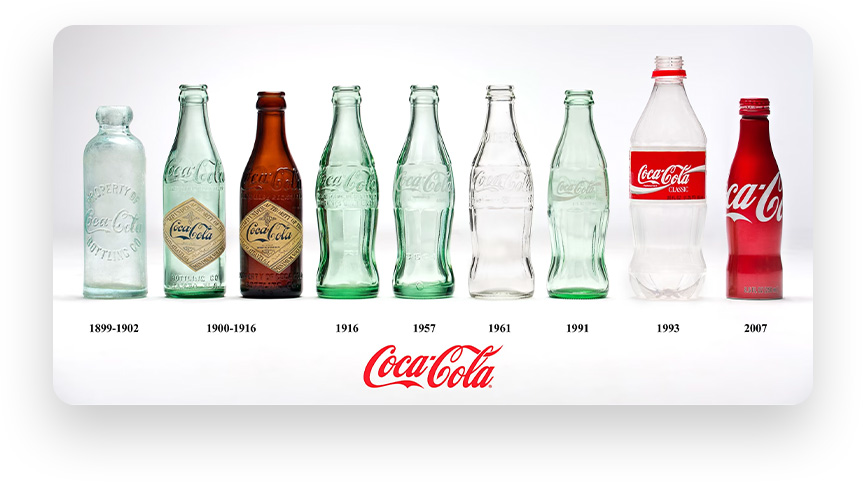
Trends will continue to be cyclical, however. Consider brands that are able to have it both ways. Coca Cola continues to market itself towards younger generations, while also appealing to nostalgia and periodically releasing old-fashioned bottle designs.
The red and white colour scheme is consistent. You can spot it from the end of the aisle in the supermarket whether it’s a cardboard carton of cans or bottles in a fridge. The bottle silhouette remains recognisable. The font flourishes are still there. Coke can riff endlessly to keep things fresh while still holding onto its identity because the base elements of the brand are so iconic.
Of course, there are still natural parameters to consider. Overly sleek typography might match a brand’s aesthetic, but could become illegible in some settings. Firmly established brands like Coke can get away with more riffing and experimentation as they’re so recognisable. But, as a rule for newer or lesser known brands, any design choice that creates a potential barrier for audience engagement is probably not the right choice.
What makes a good logo?
Logo design isn’t always an exact science. There are so many contributing factors. For starters, if your product isn’t compelling, there’s only so much that branding can do to garner attention.
Assuming you’ve got a strong product, your logo should be:
- Simple. Your logo needs to be easily identifiable at a glance.
- Memorable. An effective logo should be memorable.
- Timeless. An effective logo should be timeless and should avoid trends.
- Versatile. A good logo can be used in a variety of sizes and colours.
- Appropriate. Does a logo align and speak to the nature of your product and/or values?
In recent times, there’s been a distinct movement towards minimalism in logo design. This is at least in part due to it being ‘fashionable’. It’s likely also an attempt by many companies to future-proof their branding to a degree — leaning into the ‘simple’ and ‘timeless’ criteria listed above. The less elaborate a logo is, the less likely it is to age quickly.
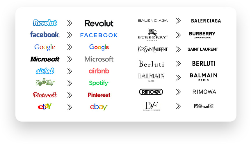
However, as wordmarks lurch towards the trendy homogeneity of sans serif fonts, the end result is a lot of brands starting to look the same. It’s worth noting that there’s a difference between simple and simplistic.
Are the new wordmarks easier to read? Probably. Are they interesting from a branding perspective? Not really. Viewed in isolation in their respective brand guidelines, it no doubt looks nice and clean. In a crowded landscape of very similar branding choices, it starts to feel a little soulless.
Fonts hanging out pic.twitter.com/rXUzNNlQp7
— Elle Cordova (@ellerhymes) January 23, 2024
Of course, there’s more to branding than logos and wordmarks, but these core graphics set the tone and often provide the basis of visual elements used across the board. There’s also arguably more emphasis placed on logos in the ‘app age’, where brands benefit from being instantly recognisable from a tiny thumbnail.
What does a successful rebrand look like?
When rebranding, there are a few ways to go about it. Most brands opt for gradual evolution – refreshing their branding every now and then to keep up with the times and avoid looking dated. While some brands will opt for a hard reset.
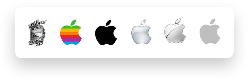
One argument in favour of gradual evolution is to retain the capital built up over decades of brand recognition. There’s been a broader trend towards minimalism in corporate logos, prompting many to bemoan the increasingly widespread uniformity, in some senses this is a natural progression for legacy brands. The longer they exist and the more recognisable they become, the fewer visual cues the audience will need to recognise it. And if you can create a logo that’s recognisable without being a distraction, then it makes sense to use it. For a tech brand like Apple whose trademark is sleek, minimalist devices, the simple silhouette logo makes total sense.
In contrast, a brand like Red Rooster that aims to foster a warmer, family-friendly vibe with a little nostalgia thrown in. Minimalist design isn’t as natural a fit here. Having said that, you’ve got to hand it to the double-R chicken face of its latest iteration.
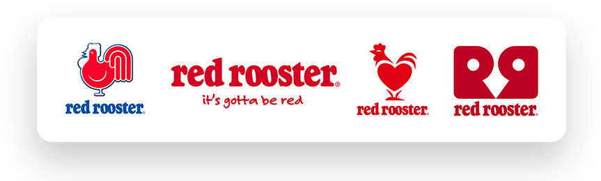
Ultimately, the job of a logo is the same as the job of copywriting — to say a lot with a little. So, in the case of Red Rooster, being able to create a tangible link to the product using only the company’s initials is *chef’s kiss*.
While the brands mentioned above are examples of evolution, what about the companies that burned it all down and started again? And what was their motivation for doing so?
The obvious recent example is that of Twitter becoming ‘X’. Of course, this was a captain’s call on the whim of new owner, Elon Musk. The shift has been jarring for many existing users, and continues to confuse people trying to find the app icon on their phones. The name Twitter and its iconic blue bird was both instantly recognisable and reflective of the platform’s purpose. In contrast, the X branding seemingly came out of nowhere, didn’t make much sense, and reflected a much colder, faux cool atmosphere. In some ways, the rebrand makes a kind of perverse sense, if only as a marker of a broader vibe shift.
Many long-time users have grown disillusioned with the app and claim the platform has changed for the worse during Musk’s tenure. From the controversial paid subscription model, to the increasing proliferation of bots and of alt-right propaganda — not to mention Musk’s own antics — the vibe has noticeably deteriorated. This is reflected in the drop in active users since Musk’s acquisition in October 2022. For many of the users still hanging on, it’s more a case of morbid curiosity and habit at this point.
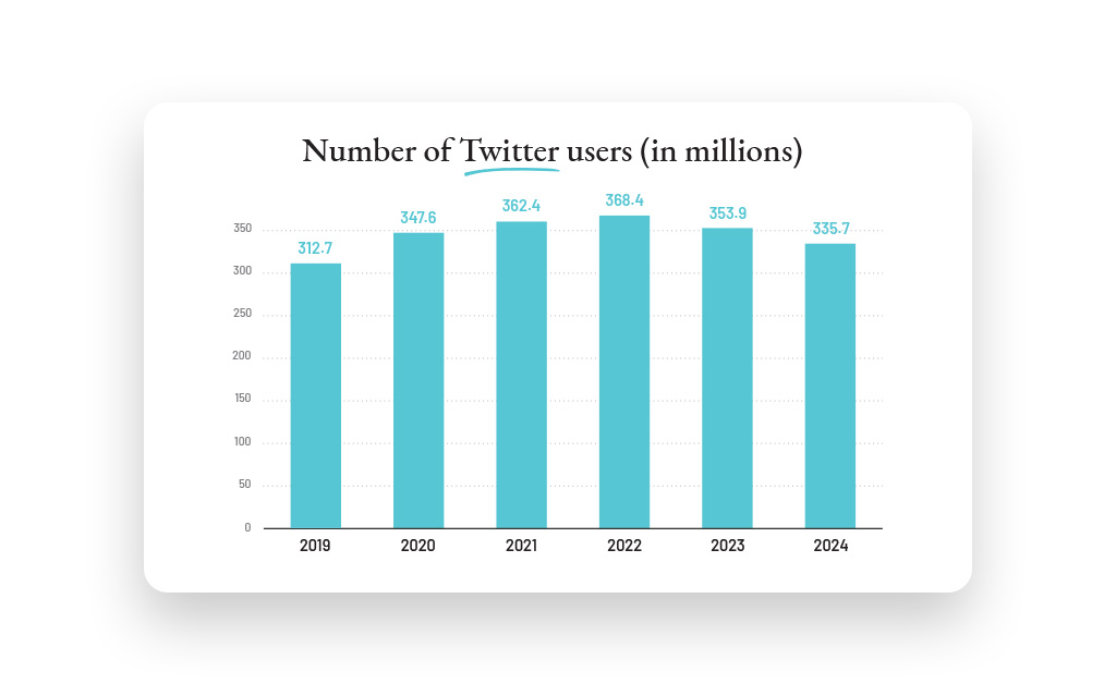
Twitter/X active daily users 2019-2024 (in millions). Source: Statista
So, objectively an unpopular and unsuccessful rebrand. But one that at least feels ‘on brand’ with its current identity.
Finding the right balance
Back on the topic of trends, is there a happy middle ground? Most brands inevitably find themselves somewhere in between. No company wants to be seen as out of touch — even if their audience is more traditionally-minded, so it’s important to keep an ear to the ground and stay conscious of changing trends as they emerge and fade around us. A company that was once completely on-trend may fade and become out-of-touch as time passes.
If you’re going to disrupt trends, it can be helpful to keep some familiar elements and not abandon everything at once, at the risk of appearing completely unfamiliar to the target audience. Investment decisions can be made in a split-second, on a subconscious level. So, while you might choose eye-grabbing colour to stand out from competitors, it can be useful to stick to other conventions like typical font choices or website imagery to ensure that connection is still made with your audience.
Sprinkling in trendy surface elements onto a foundation of a brand can be a solid approach. Minor refreshes might include expanding a colour palette to utilise new combinations, or to give a website a touch up with a new font choice.
How to use design trends to your advantage
- Look at your competitors. Not to copy them, but rather to spot potential opportunities. Trends aren’t an abstract rule. They’re made up of expected norms that companies — especially industry leaders — are presenting. How are similar brands in your industry positioning themselves? Do you want to appear more like them, or can you capitalise on the space that they’re ignoring?
- Test small before swinging big. You can experiment with sub-brands, short campaigns and small collateral projects. Maybe a specific sales campaign contains a fresh look that utilises more colour or new font choices. Depending on how these resonate with your audience, these new design principles can be integrated into the broader brand, website, brochure and so on, while discarding stale elements.
- Take a risk. This is mostly applicable to newer brands or those starting from a lower base of recognition. For well-known or growing brands, it’s usually a case of ‘if it ain’t broke’. It’s worth noting that all trends are uncool before they rise to popularity. In other words, don’t be afraid to try something new. It won’t always be a hit, but remember that the primary role of branding is to be memorable. It might feel like a daunting investment, but standing out from the crowd is half the battle.
A unique brand look takes more work, as you need to break assumptions and create new meaning in the mind of your audience. Rather than leveraging established associations, there needs to be a conscious effort to communicate and set your new look as the standard, through marketing campaigns to build familiarity, along with consistent brand story development to ensure that messaging aligns with the brand’s look and feel.
